Personal Brand: The New E
- Class: Brand Identity
- Scope: logo, brand, typography
- Technologies: Illustrator
- Year: 2014
Description:
For my Brand Identity class, Project one was to provide three distinct logos for a company.
The company that I chose was my personal business, which I’m moving from edwardalonzo.com to thenewe.com (currently redirects to edwardalonzo.com). I had no logo for my new brand, though I did use my name logo on my invoices.

The inspiration for my logo designs came from sketching on the question “what would a new e look like?” after various sketches I came to some basic forms that evolved into the currently presented ones.
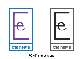
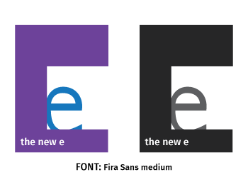
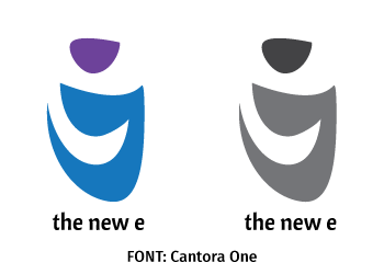
The first and second are forms of ‘E’ and ‘e’ combined. The third logo derives from a negative space ‘e’.
The fonts I chose were sans serif for a “clean” modern look and were chosen because I felt they had similar characteristics as the logo symbols. Francois one balances modernness and elegance, Cantora One is modern and a little edgy, and Fira Sans medium harkens to the modernist period in art.
My personal brand re-design is still in progress, with some exciting changes and a new website soon to come. So stay tuned!


