The New E Logo
- Client: self
- Scope: logo
- Technologies: Illustrator
- Year: 2015
Description:
My Logo has been evolving for the past year, and I thought I’d show the progression and some of the process that brought me to my New logo.
The evolution:
It all started as a Brand Identity Class Project, that lead me to three logos. Of which I chose:
From there, I incorporated feedback to make it less tall and more horizontal.

Eventually, I cleaned up the text to a sans serif and less cartoonish choice.
Being dissatisfied with how it felt/looked in this format, I dropped the bottom of the logo and made the logotype horizontal. And I added the primary services (at that time) I provided.

While developing my portfolio site, I found that the font didn’t quite work for headings, and I wasn’t satisfied. So I reviewed 703 fonts from Google Fonts and selected a list of 18.
From that list, I eliminated fonts with only one weight and brought the number down to 12. I reviewed all the font weights for the twelve and created a logo test sheet.

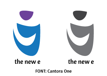
And from these twelve, I chose Poppins in two weights, light for “the” and regular for “new e.”
Leave a Reply